Y-dra
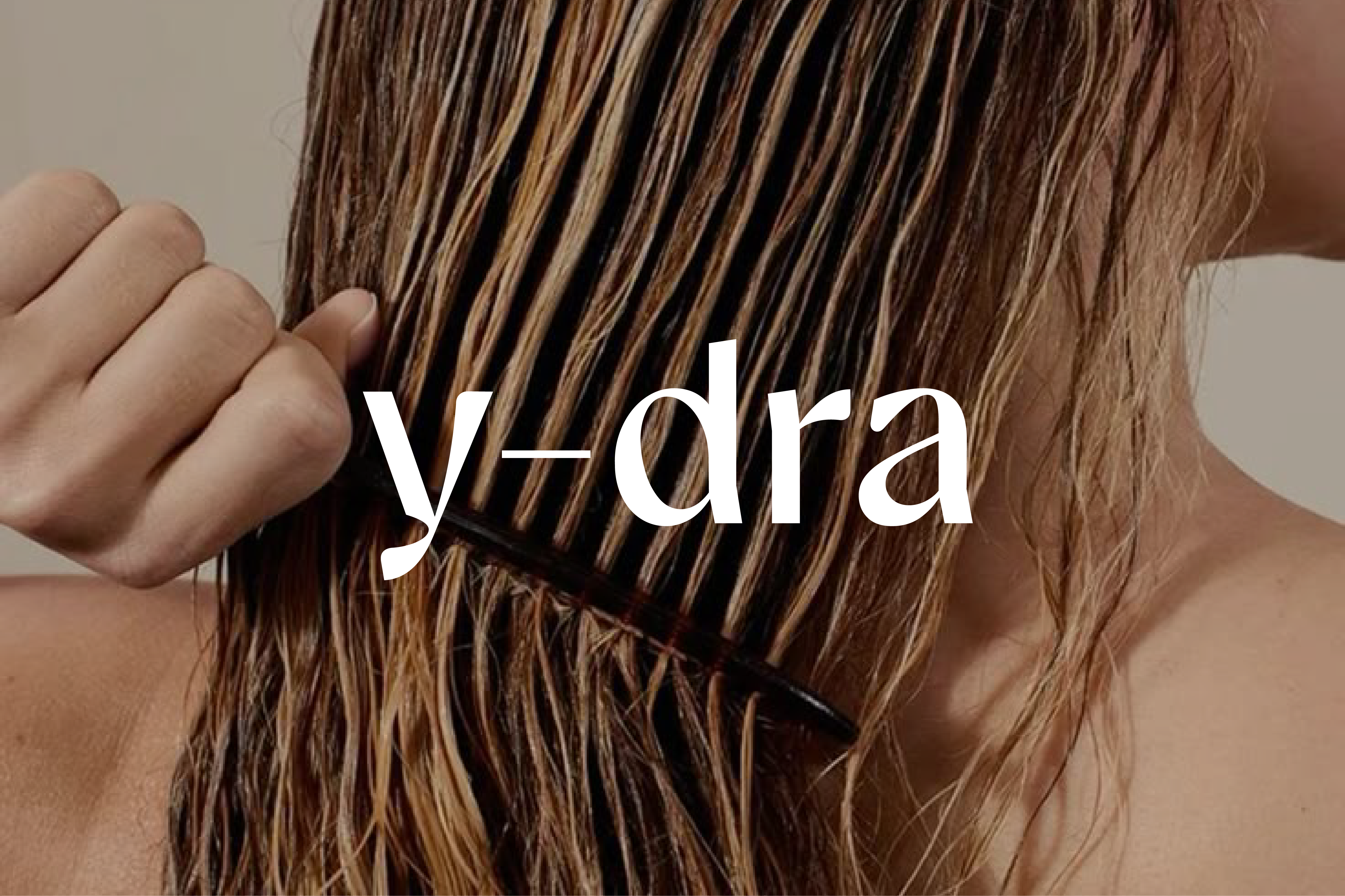
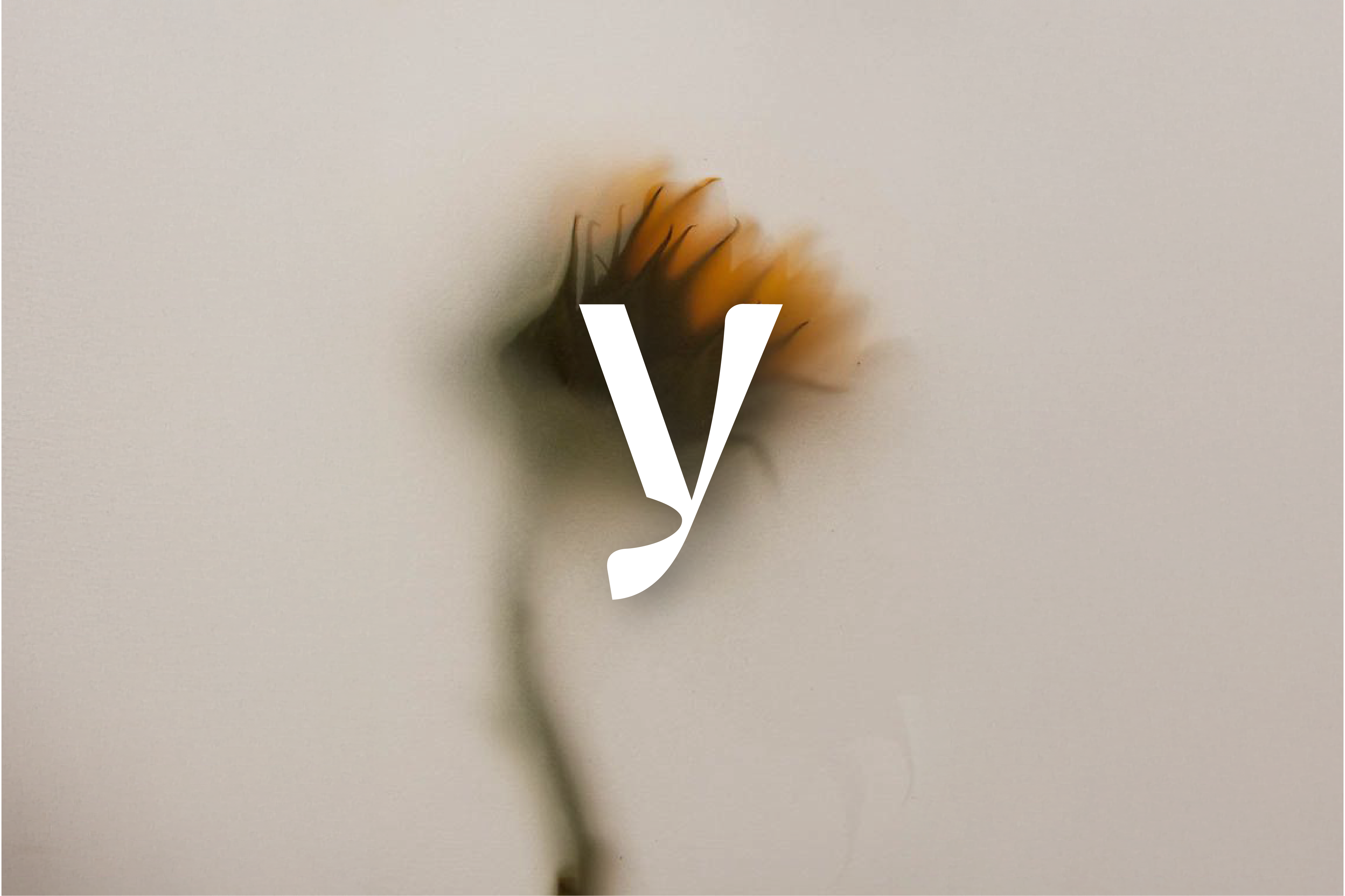
Y-dra is a haircare brand shaped by skincare principles: delicate, intentional, and rooted in nature. Its name, drawn from “hydra,” conveys hydration and softness, distilled into a typographic identity that pairs a sculptural serif with a monospaced hyphen. This visual pause acts as a recurring motif, creating rhythm and structure across the brand’s universe, from packaging to photography and printed matter.
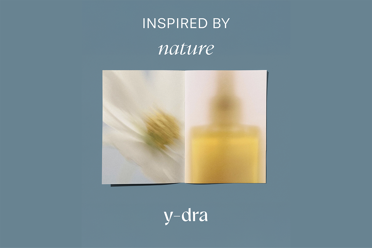
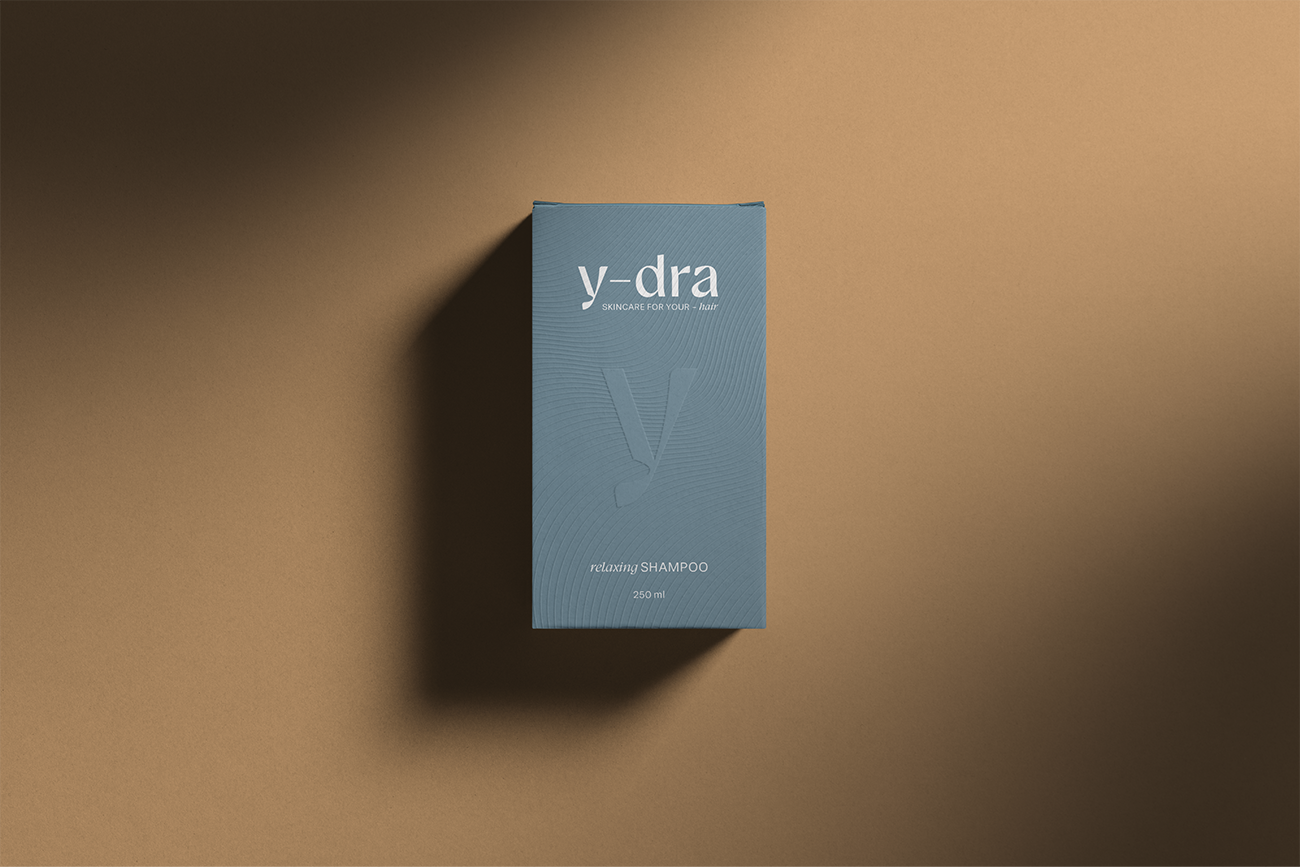
The packaging system is designed around tactility and restraint. A slate blue core color anchors the palette, complemented by warm neutrals inspired by natural oils and treatments. Blind embossing and soft-matte finishes lend quiet texture, while the signature ‘y’ is subtly pressed into the surface like a watermark. Materials are carefully chosen to echo the sensorial experience of the products themselves: soothing, weighty, and refined.
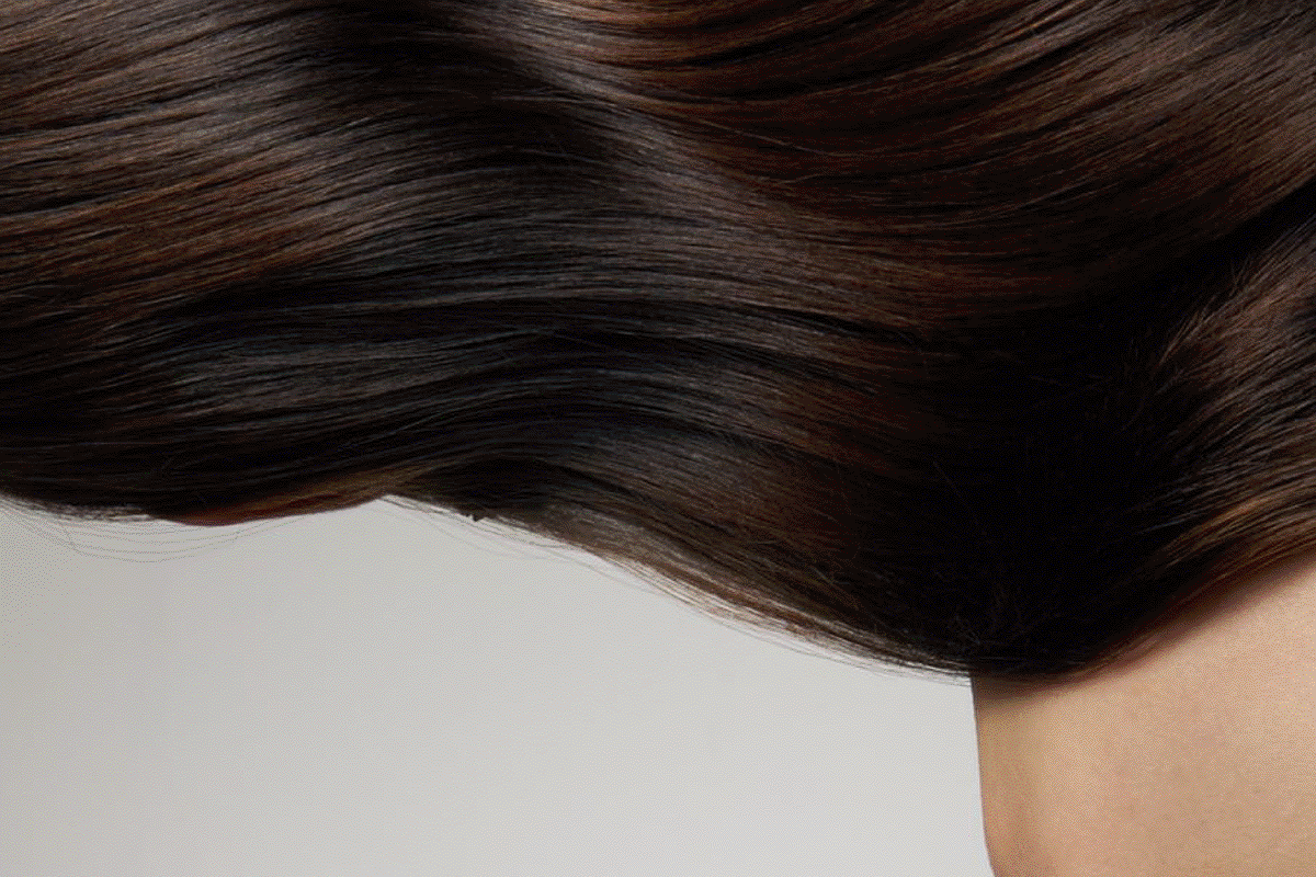
Visual storytelling focuses on moments of care: hair combed, conditioned, and nourished in golden light. Photography captures the interaction of product and gesture: oil against skin, cream in motion, framed with warmth and clarity. Editorial typography reinforces the brand’s contrast between softness and precision. Y-dra becomes a visual ritual: a language of calm, repetition, and understated transformation.