Asa Matcha
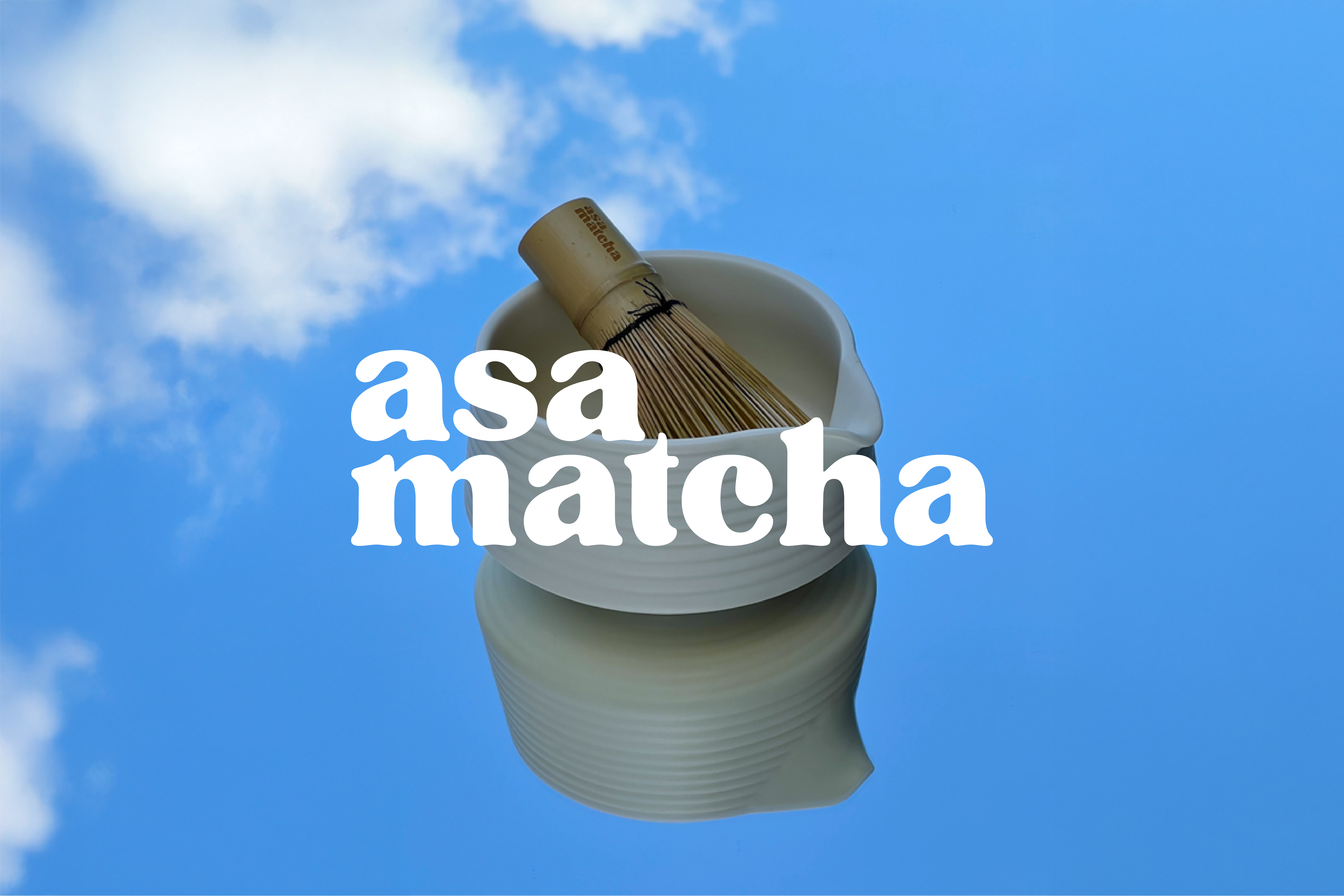
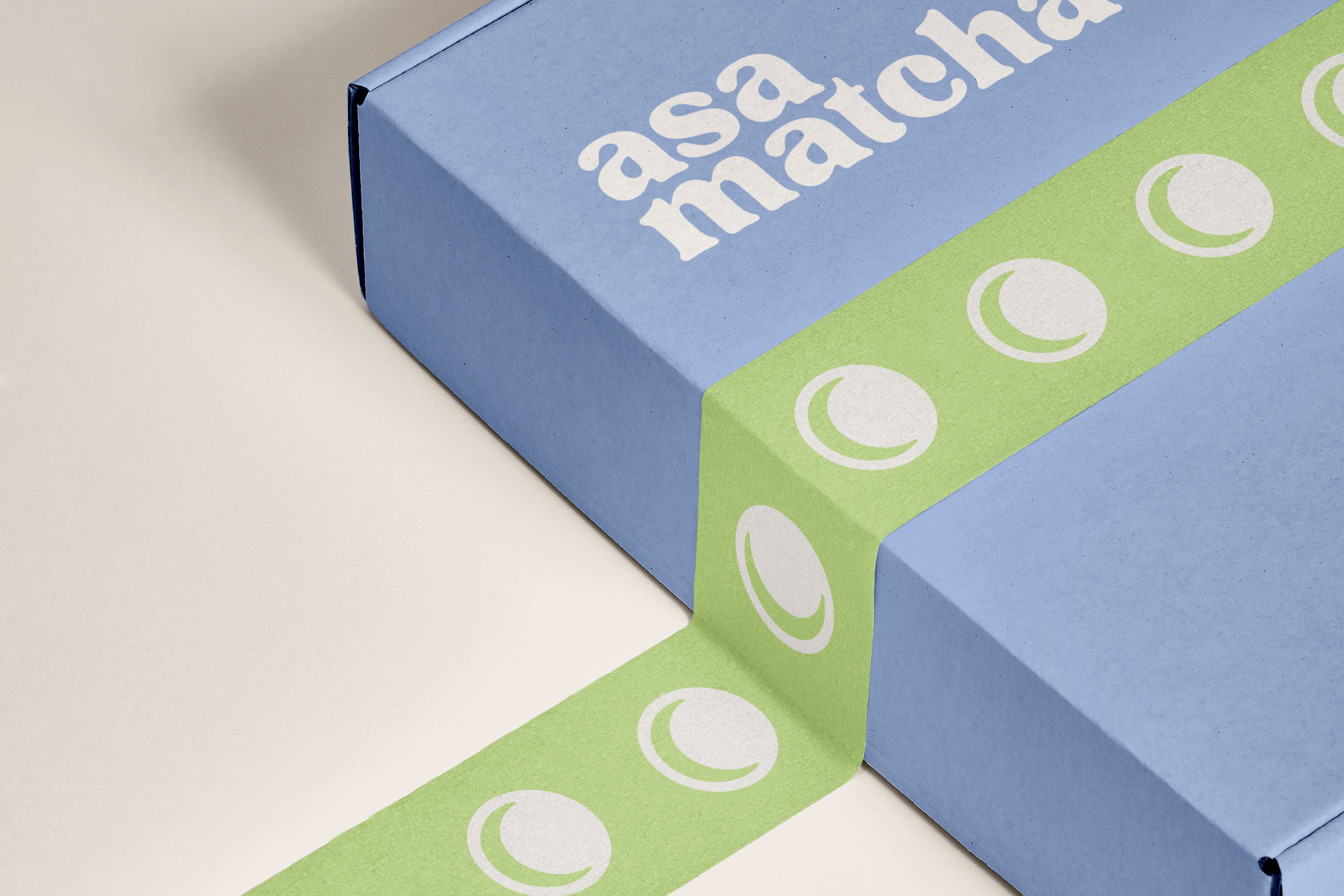
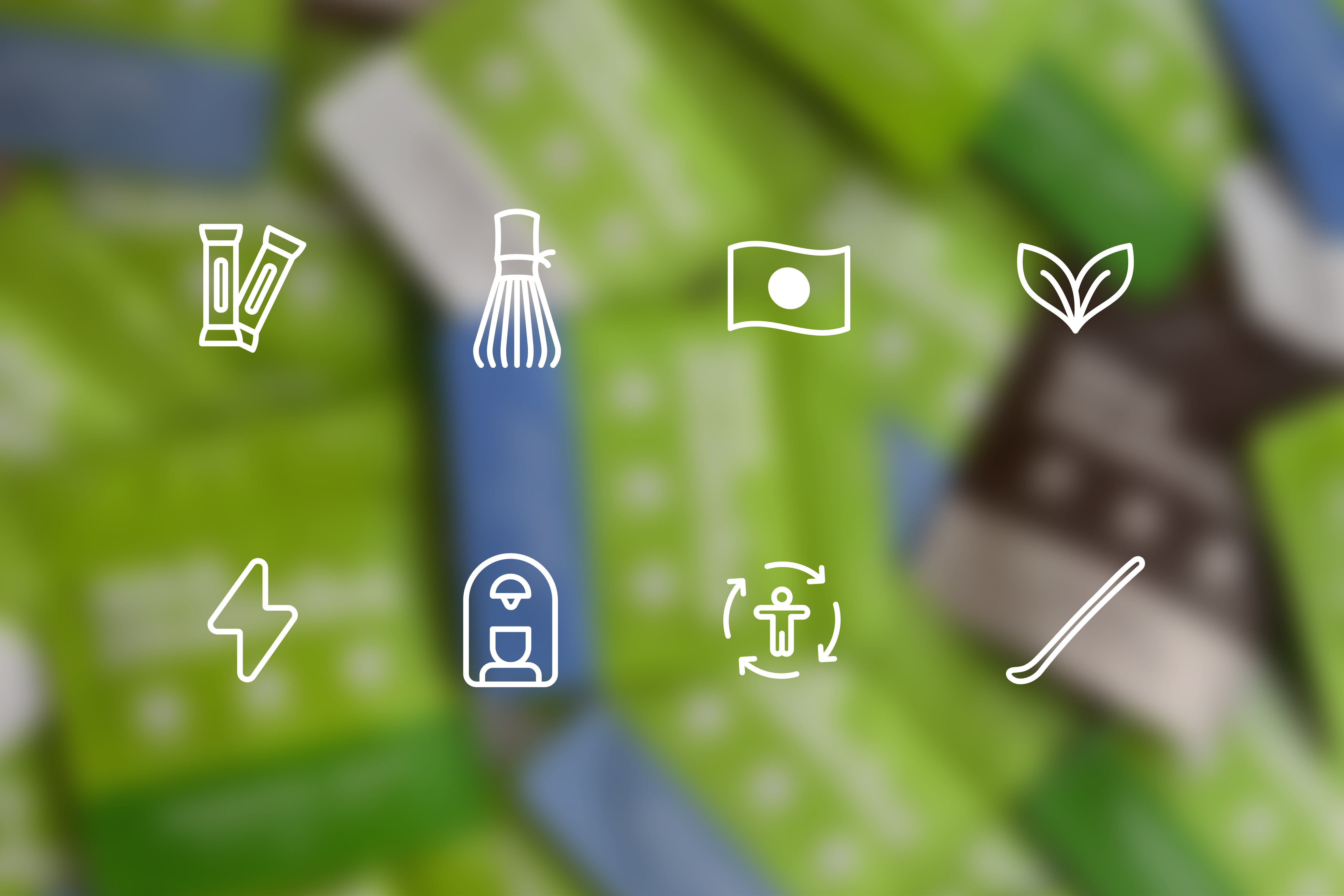
The Asa Matcha brand identity was built around a balance of contemporary clarity and ritual heritage. A fresh, mineral green anchors the palette, paired with a powdery blue that recalls Japanese ceramics and serene skies. Bold, rounded typography lends a modern, approachable voice, while custom icons distill the matcha experience into clean, recognisable marks. At the heart of the identity is a circular logo that unites sun and moon to symbolise ASA, morning in Japanese, while also evoking the curve of a matcha bowl and a gentle smile.
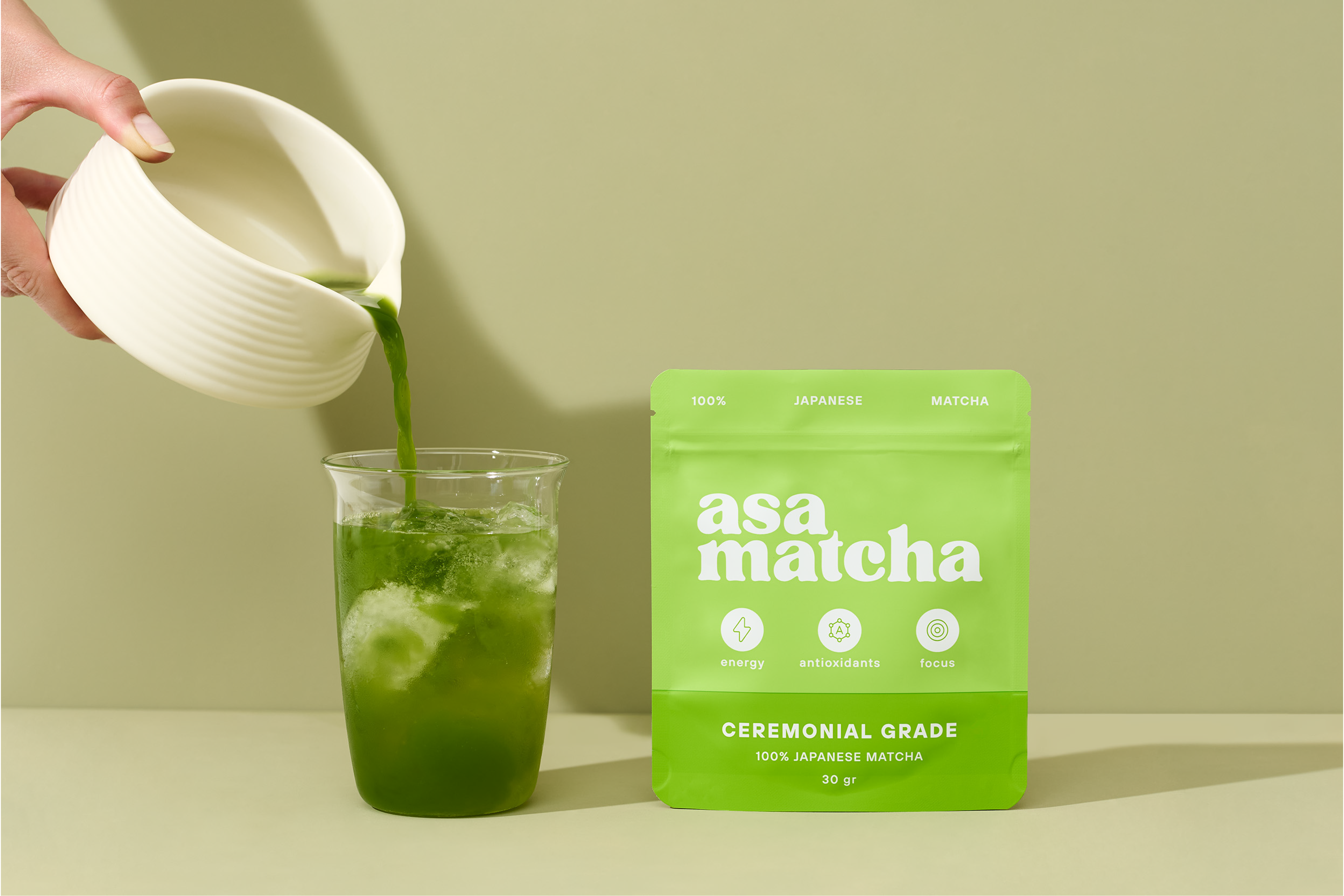
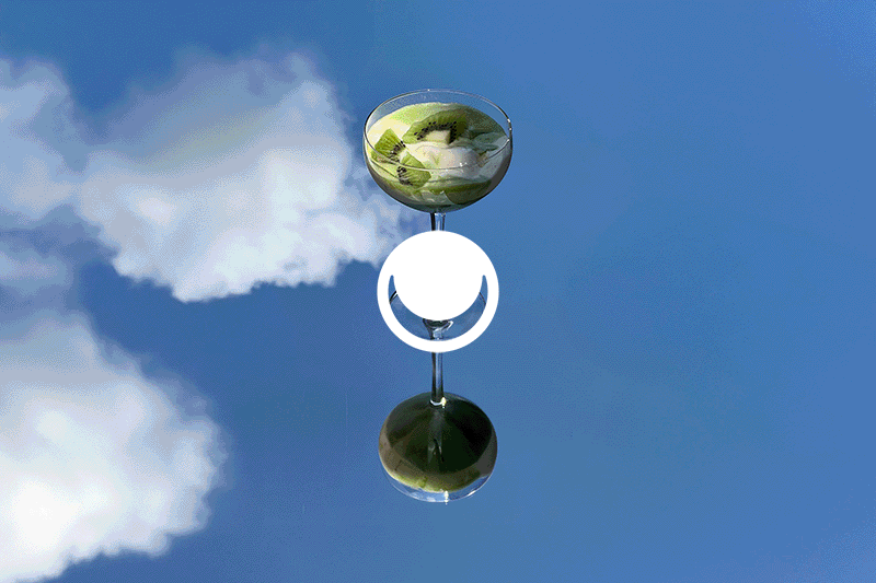
Photography was crafted to immerse the viewer in texture and atmosphere. From the froth of whisked tea to the crystalline green of an iced pour, every detail is captured with precision. Clean compositions, natural light and soft shadows create a sense of calm vitality. Whether it is the cool translucency of glass against a sage backdrop or the grounded warmth of wood beside the deep green of the drink, each image invites the viewer into the ritual.
With this launch, Asa Matcha joins De Bijenkorf, one of the Netherlands’ most prestigious department stores. This milestone offers the brand exceptional visibility and a direct connection to a discerning audience. Bringing Japanese matcha to such a renowned retail setting reinforces the brand’s position as fresh, authentic and ready for the international stage.